
Explainer
Vector or Raster? Figures in a Publishing Pipeline

The Distinction
Pixels Describe. Instructions Draw.
A raster image is a grid of pixels — a photograph of your figure at one fixed resolution. Enlarge it and it blurs; search it and you find nothing; the text inside it stopped being text the moment it was exported. A vector image is a set of drawing instructions — lines, curves, real text — executed fresh at whatever size the output needs: crisp on a phone, crisp on A0 paper, same file. Photographs are inherently raster. Diagrams, schematics, and charts are natively vector, and only become raster when a workflow flattens them for convenience — which is precisely what the charts-as-screenshots ritual does at scale.
The trade cuts the other way too: vector complexity is real. A raw CAD export can carry hundreds of thousands of instructions, and every view re-executes them — the honest answer for heavy vector art is “it works, but the render takes longer.” Purpose-drawn illustration, not engineering dumps, is what keeps vector fast.
The Pipeline
One Source, Every Output — Figures Included
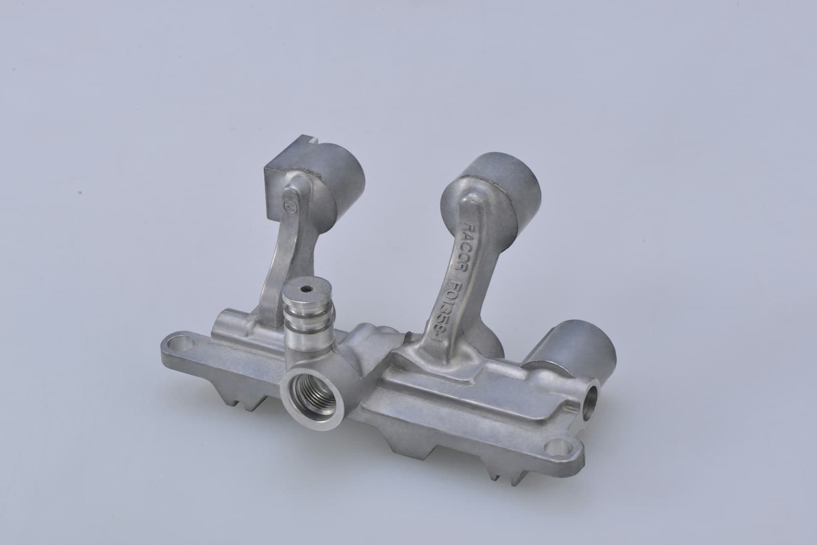
In a single-source pipeline the rule is simple: photographs stay raster at per-output resolutions; line art and schematics stay vector so the print PDF and the zoomable web view come from one file; and charts — the special case — stay data, rendered per output, because the strongest format for a figure is the meaning behind it. That last move is also the accessibility answer: a raster figure gives a screen reader only its alt text and gives search and machine readers nothing, while content kept as content — the table behind the chart, the callouts beside the diagram — reaches every reader regardless of pixels.
Aerospace formalized all of this decades ago: technical illustration under standards like S1000D treats figures as managed content with their own control numbers, formats chosen per purpose, delivered by the same pipeline as the text. The enterprise version of that discipline is smaller but the same in kind: decide the format by what the figure is, keep the meaning as data, and let the platform serve each output what it needs. Your designers already know this instinctively. The system should too.
FAQ
Questions We Hear
What's the actual difference between vector and raster?
A raster image is a grid of pixels — a photograph of the figure at one resolution, which blurs when enlarged and holds no interior structure. A vector image is a set of drawing instructions — lines, curves, text — that renders sharp at any size, keeps its text as text, and stays editable. Photographs are inherently raster; diagrams, schematics, and charts are natively vector and only become raster when someone exports or screenshots them.
Which belongs where in a publishing pipeline?
Match the format to the content, not the tool's default. Photographs: raster, at controlled resolutions per output. Line art, schematics, and technical illustrations: vector, so the PDF prints crisp, the web version zooms cleanly, and the same source serves both. Charts are the special case — the best 'format' for a chart is the data itself, rendered per output, with vector as the export when a static figure is unavoidable. The classic failure is diagrams and charts flattened to raster for convenience, which throws away sharpness, text, and meaning at once.
Why do vector figures sometimes render slowly?
Complexity. A vector file is instructions, and a CAD export can carry hundreds of thousands of them — every rivet outline, every hidden layer — which a renderer must execute on each view. That's why publishing pipelines flatten monstrous vector art or simplify it for delivery, and why 'it'll work, but the render takes longer' is the honest answer for heavy vector content. The fix is illustration discipline: purpose-drawn technical art rather than raw CAD dumps.
What does the choice mean for accessibility and machine readers?
A raster figure is opaque: a screen reader gets only the alt text, and a search or AI system gets nothing at all. Vector formats can retain real text (searchable, sometimes readable in order), which is better — but for both audiences the strongest pattern is the one structured publishing uses anyway: keep the meaning as content (the data table behind the chart, the callout list beside the schematic) and let the figure be presentation. Then every reader — human, assistive, machine — gets the substance regardless of pixels.
Get In Touch
Figures Worth Their Format
If your diagrams blur in print or your charts are screenshots, the figure pipeline needs the same discipline as the text. We build both.